RouteRite — Lead Scoring & Funnel Analytics
The data side of the RouteRite build: a SQL scoring model and a two-part Tableau dashboard built on top of the same CRM data from the HubSpot landing page project — figuring out which leads actually deserve a call first, and proving it with the numbers instead of a gut feeling.
The Problem
The HubSpot side of RouteRite proved leads could land cleanly in a CRM with no custom code. But a CRM full of contact records doesn't tell anyone which lead to call first, or whether the leads that look "good" on paper actually move faster than the ones that don't. That's a different problem — not "can data get into the system," but "can I get something useful back out of it." I exported the real leads from HubSpot (a mix of 50 backdated contacts and 10 live form submissions), brought them into Postgres, and built a scoring model and a dashboard around them to answer that.
What I Built
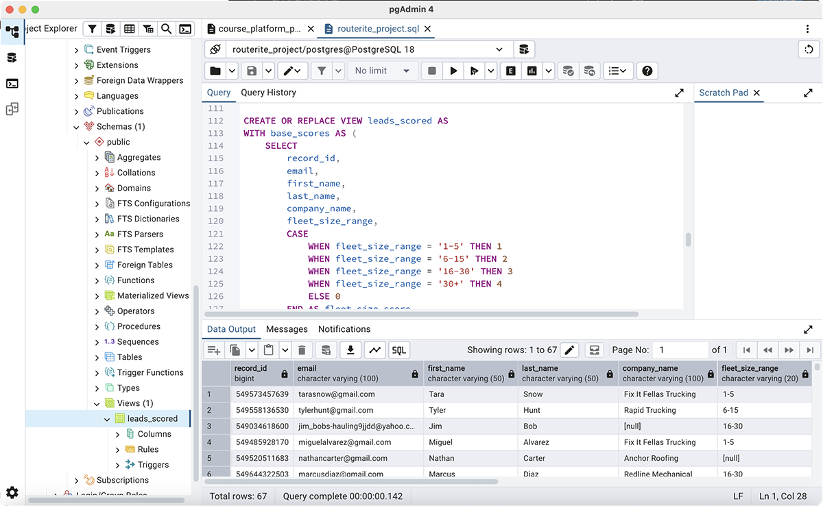
- A lead-scoring model in SQL: points for fleet size and points for how far a lead has actually progressed (quote requested, status manually updated by a rep), combined into a total score and bucketed into Hot / Warm / Cold priority tiers with CASE logic.
-
All of that scoring logic lives in a single Postgres
VIEWrather than repeated across separate queries — write the CASE statements once, and every question after that just queries the view like a normal table.
-
A funnel-velocity metric (
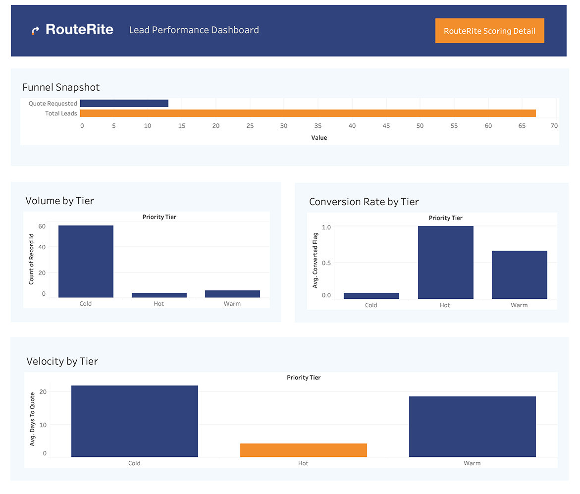
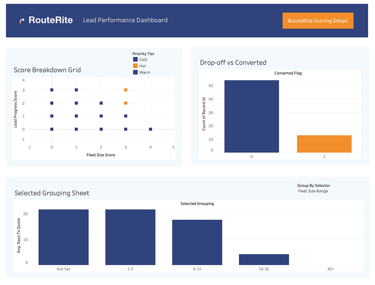
days_to_quote) built straight into the same view with date subtraction, so "how fast does a lead move from demo request to quote request" is just another column, not a separate calculation to remember. - A two-part Tableau dashboard: an Overview page (funnel snapshot, volume by tier, conversion rate by tier, velocity by tier, and a trend of velocity over time) and a Scoring Detail page (a score breakdown grid, drop-off vs. converted, and an interactive chart that lets you re-group velocity by Priority Tier, Fleet Size Range, or Lead Status on the fly with a parameter-driven dropdown).
Key Decisions
Once I had a working scoring formula, I didn't want to rewrite it every time I asked a new question. Wrapping it in a Postgres view meant the
logic exists in exactly one place — every query after that just points at leads_scored and gets the scoring for free.
My first version of the "progress" score only looked at the manually-set Lead Status field. That missed leads that had genuinely requested a quote but never had their status touched by a rep — a real blind spot, not a hypothetical one. Adding a second condition that checks for a quote-requested date directly, independent of status, fixed it.
Velocity by tier, by fleet size, and by lead status are three different lenses on the same underlying question. Rather than building three charts and eating up dashboard space, I built one chart backed by a parameter and a calculated field, so the viewer picks the lens themselves.
The summary story (funnel, tiers, velocity, trend) and the more exploratory detail (the scoring grid, the interactive chart) are two different audiences' worth of content. Splitting them into an Overview and a Scoring Detail page, connected by a simple nav button in the header, kept each one focused instead of one dashboard trying to do both jobs at once.